The brief
ember. needed a studio site broad enough to present membership platforms, operational web apps, marketing sites and editorial products without becoming a catalogue of unrelated technologies. The identity also needed to feel confident and technical while keeping project enquiries straightforward.
The work
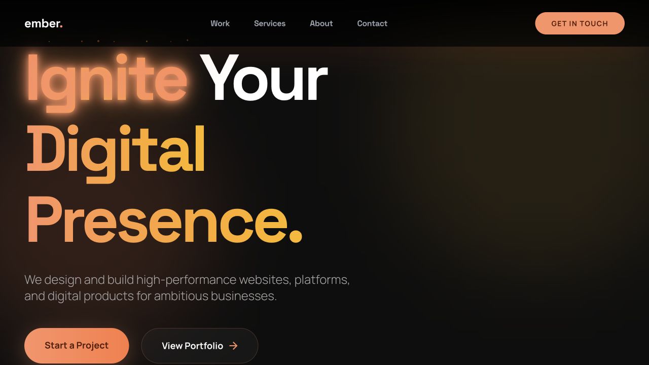
Fyllio developed a dark, high-contrast visual direction around the ember name, pairing oversized editorial typography with orange signal colour and motion-led details. The architecture separates capabilities into custom platforms, web applications, marketing sites and publishing, then backs those claims with a modular work archive, project summaries, client testimony and dedicated service, about and contact pages. Responsive layouts and a persistent operational-status detail give the site a product-minded character rather than conventional agency gloss.
The result
The live site now gives ember.’s varied work one coherent narrative. Prospective clients can move from a capability to a relevant example, understand the studio’s emphasis on responsive, reliable, scalable and supported delivery, and start a project without decoding a stack-first services list.